The original concept for the Open Doors front cover was to use a front door with the name on it. The client Frances sent me over an image of how she wanted it to look.

(client design)
Frances wanted the magazine to stand out and to be different from other magazines. However with the image she sent me, I thought the cover wouldn't stand amongst others and the type was quite illegible. I suggested that she could possibly use more impact photography and brighter colours.

(client design)
She then wanted to change the style of the font to a more script style font and use a model for the front cover. She sent this image to me as another example of what she wanted.

I then was sent another image that she wanted to use for the front cover as a final and I felt this image would fit in with the style of magazine and what she wanted and started to experiment.
I created a initial contact sheet of front covers for Frances to choose from, that experimented with hand drawn / brush styles of typography that she wanted for the magazine.


From these developments she selected two front covers that she wanted me develop further with a range of outcomes that she could choose from.
She gave me some further guidelines on what she wanted from them.
- Thicker and bigger font
- White colour
- Issue 1 to be displayed on the cover
From these notes I decided to experiment further with each design creating more mock ups.
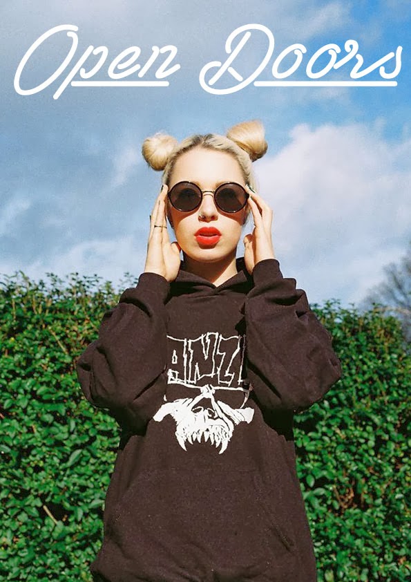
Design 01:


Taking on board the notes I started to develop the first cover experimenting with placement, alignment and also adding extra type to explain what the magazine was about.
From these first further developed designs I received some good feedback from Frances saying she loved the designs and chose a selection that she wanted to possibly use. I then said I would develop the other cover font to see if she liked them better before she made any final decisions.
Design 02:


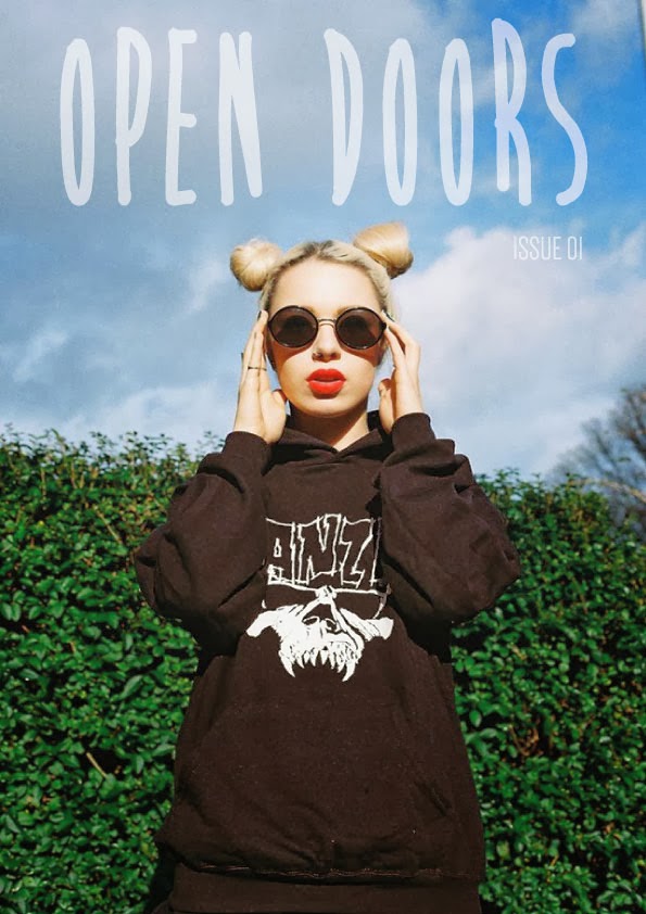


From these next set of designs I started to experiment with coloured filters and type. From these design she also selected a few she liked. After some debating she finally chose this cover as a final design.

Since the magazine was going to be the first issue, she again wanted me to try an add the small tag line which I proposed in one of my designs, so I again made a some adjustments.

The development of the front cover has been quite a long process, obviously creating a multitude of designs for the client to choose from and then changing / making adjustments to fit what they want it a long process. However I find it quite rewarding when you design something they like and want to use. I think the cover has come a long way from the clients initial idea's and looks more like a magazine cover than it initially did.
No comments:
Post a Comment