Brief: To create a viynl sleeve for a artist through an interpretation of a selected song. The brieft is run by Secret 7. This is an opportunity to visually and conceptually exploit every possible angle of your ideas. We are expecting a visual feast of ideas before you even consider resolving the problem.
Secret 7" artwork design for chosen songs by the following artists:
Secret 7" artwork design for chosen songs by the following artists:
- Public Enemy - Harder Than You Think
- Elton John - Bettie & The Jets
- Nas - The Don
- Jessie Ware - Still Love Me
- Haim - Better Off
- Laura Marling - The Beast
- Nick Drake - Rider On The Wheel
After looking at all the song's and artists I decided to choose Jessie Ware as I really liked the story she was portraying through the song about love. I also liked the electronic vibes of the song which inspired me to look into geometric and sharp edged patterns to fit in with the genre.

I then followed this by creating 30 thumbnail sketches of potential designs.


After creating these designs I focused on 5 main designs that I wanted to take further. Also with research I had done I had a few design methods in mind.
CONCEPT: 1
I first experimented with the geometric heart design from my sketches.


The song is about love and how she is unsure if someone still loves her. The song had a really electronic vibe so I felt these sharp shapes would really connote the genre of the music. I also made the heart shattered because I felt that the artist was experiencing heart break.


The song is about love and how she is unsure if someone still loves her. The song had a really electronic vibe so I felt these sharp shapes would really connote the genre of the music. I also made the heart shattered because I felt that the artist was experiencing heart break.


I then started to incorporate the different triangle shapes emitting from the broken heart. I again used the triangle shapes tool and the line tool to create equilateral and acute triangles.

I then experimented further with how the triangles could be placed and created different same shapes patterns of triangles so I could create symmetry.

I then finally came up with this design, I was really please with aesthetic of the design and it looked digitally graphical. I also felt that it represented some of the artists sub genre of music which was my intial idea. If this design was chosen as the final one for submission I would have experimented with simplistic colour like black and white or red.
CONCEPT: 2
For my next design I wanted to experiment with photography. I also felt themes of entrapment and being held hostage by your thoughts and i wanted to express this.
ABSTRACT -


.JPG)


ABSTRACT -


MODEL -

.JPG)


I began taking images of my friend and styled her in a Jessie Ware style with her infamous cat eyes and strong eyebrows. I also took some abstract images of gates and buildings that could incorporate as guards to express the feeling of entrapment.

From Jessie Ware's style I also found from my research she works with a lot of black and white in her music videos. So I initially edited the image to black and white on Photoshop. I also used the threshold tool to create outlines of the models face which made them really stand out amongst the white background.

I then used one of my abstract images and I really liked the shapes of these gates I found. I then began editing them over the top of my original image of the model, using colour blending tools such as the lighten and darken modes to see how they would work.

Some of the modes still left snippets of the backgrounds of the image so this prompted me to experiment with the arrangement of the texture.

I tried only using half of the texture.

I then also experimented with the length of the image.

I then experimented using the ends of the image. but when I put them together they didn't match, this then prompted me to create a seamless symmetrical design.

I took one half of the texture and then reflected it on Photoshop using the flip and angle tools.

I then the design to the original image of the model and used the lighten tool to create this design.

I then experimented with colour, using red to fit in with the themes of love to see the outcome.

I then experimented futher with the texture and doubles up the texture, and using the darken tool this time. I started to feel the texture took away the features of the model so I decided to re-look at the artist style.

I wanted to create something that gave a representation of entrapment and loosing the mind so I experimented with the distortion filters on Photoshop Jessie Ware has a vintage and 1960's style so I used a Halftone effect which was a prominent effect.

For the first final design I expanded the dots used to make it bigger.
CONCEPT: 3
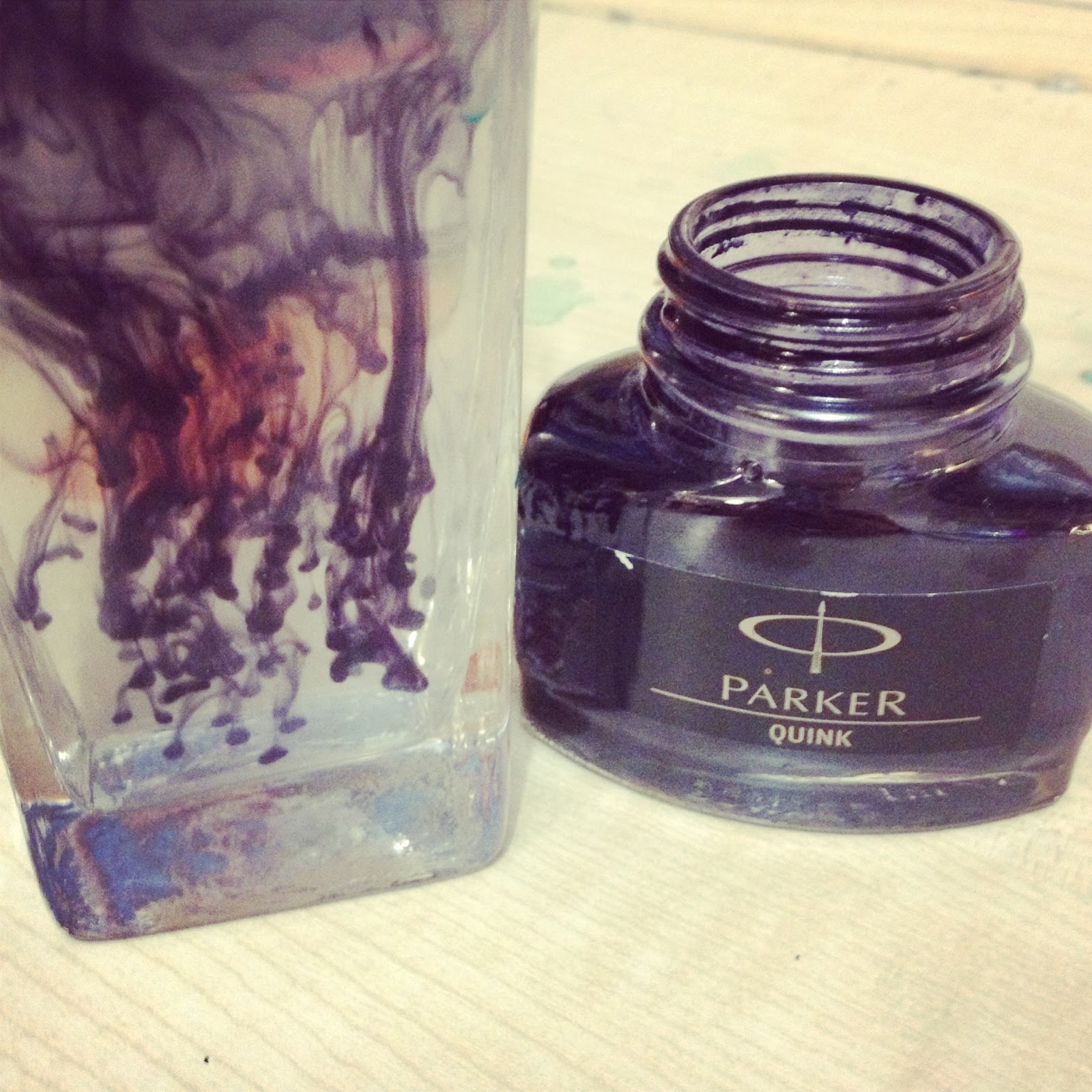
Another concept I chose to explore from my intial sketches was the rochart test. I firstly created some textures by using acrylic's. I then developed this idea by creating stencils of jessie ware and then scanning them in digitally and editing them.


After experimenting with these colours I looked back at my intial idea's and was influenced by one design of a girl that had patterns swirling out of her head. This then prompted me to find a iconic picture of Jesse Ware and I printied it in black and white making it into a stencil as a guide.


After cutting round the stencil I then used black parker ink to mark the outlines of her face.


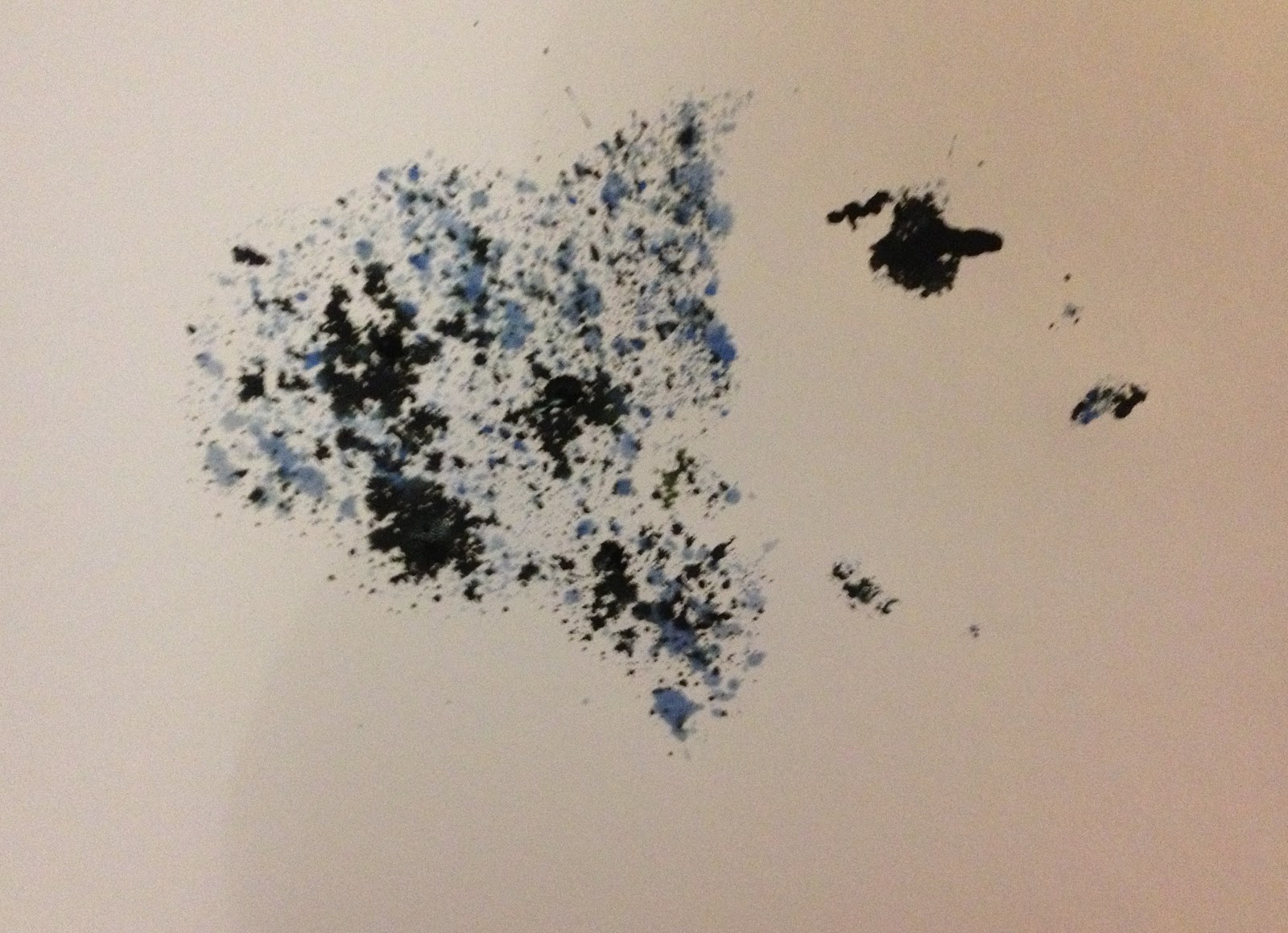
After creating on version of her face, I folded the paper while the ink was still wet to create a rorsach style image.

I felt that the design was quite messy but I liked how the mouth created a bleeding heart shape. I then started to experiment further with colour by taking back the stencil and experimenting with colour splodges for the hair to represent the girls mixed emotions.


I experimented with different colour variations that expressed a range of emotions from sad, angry and happy as these were the feelings I interpreted from the song.

As I experimented more the less effective the design became as the stencil became soggy due to all the water, ink and paint.

I liked the concept so I took two of the images I felt were the strongest designs of the rorsach test were on the left so I scanned them in to digitally manipulate.
I scanned in on image and then other and using photoshop I croped and attatched the two images together and then doubled them up. I then reflected them to create symmetry that the rorsarch test has.

I experimented with different hue's and saturation to see which one looked best and cleaned up some ink lines so it looked stronger.

Overall I was really pleased with this design I took the image above to the crit as I felt the saturation was how I intended.
Looking back on how it intially started to the end project was really interesting to see how it progressed.
CONCEPT 4
After creating my rorsach variations I decided that I could experiment with the design further. I took away one of the heads and began focusing on making the one image stronger.
I again experimented with the saturation of the design and kept asking for feed back on how the ink ran on the image before the presentation.
The overall comments from my peers said they liked how there was a mixture of both strong outlines with a little ink effect.

I then experimented with design further by using the brush tool in photoshop and added a few more splodges digitially at a low opacity so it look insync with the rest of the design.

I also lowerd the opacity and took this variation in for the final crit before submission.
CONCEPT: 5
After designing my Four concepts, I really wanted to experiment further with a geomtric circle pattern. A few of m thumbnails explored this concept but I was unsure of how I could execute it clearly by hand, so I experimented on the computer.
I refferd back to intial thumbnails and created a few outcomes.
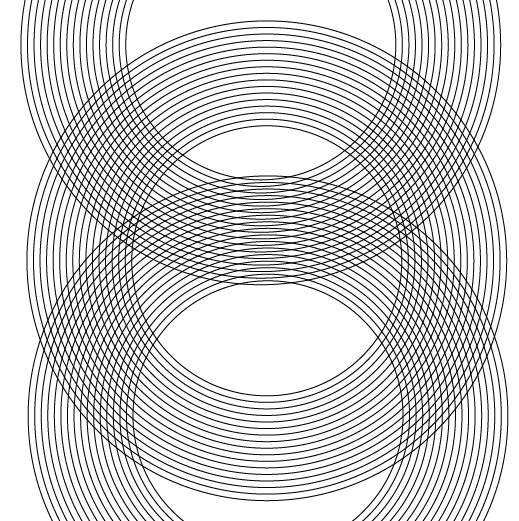


However I felt that the other designs I produced were stronger and decided to leave this one out for the final crit.
Overall I really enjoyed this brief, I think music design is something I want to go down in the future and explore further. However I think that my final outcomes for my designs could have been executed better and even further. I always have issues with time and in order for me to create something I am really pleased with I will have to sort out the way I plan my time.
The final crit comments and evaluation for this brief are posted to my PPP blog.
No comments:
Post a Comment