Based on the content of the lectures, workshops and tasks intoduced throughout the module so far, identify 10 principles, facts or concepts that you think 'people' need to know about Graphic Design. You should aim to collect a range of research and source material related to each of your 10 things including texts, quotes, images, diagrams, information and statistics. The information that you gather will be used as part of an exploration of Studio Brief 2 and so digital versions or reproductions will be needed over the following weeks.
Categories:
- Informative
- Formal
- Forceful
- Suggestive
- Playful
- Fun
- Humour
- Sarcasm/Innuendo
- Relaxed/Light Hearted
- Play on words
- Sympathetic
- Powerful/Strong


I looked at two examples of design that follow a tone of voice as a refferal.
I will introduce the the different names for the colours, including the complementary colours. Designers need to be aware of these as they can be beneficial to choosing which colours work best.


Complementary: Complementary colours formed by juxtaposing colours on the wheel.
3. COLUMNS, GRIDS + MARGINS
Primary: Colours that can't be made by other colours. These included red, yellow and blue.
Secondary: is a colour made by mixing two primary colours in a given colour space.
Tertiary: is a colour made by mixing either one primary colour with one secondary colour, or two secondary colours, in a given colour space.
Complementary: Complementary colours formed by juxtaposing colours on the wheel.
These 3 features benefit designers to create an overall equal and guided layout. It's important to know there uses and what they do.

Grids: A grid is a 2 dimensional structure made of intersecting horizontal + vertical axes used to structure content. grids serves as a guideline which helps designers organise their content in a rational + aesthetically pleasing way. A grid enables a designer to align elements into columns and rows which creates a wide variety of layouts.


Columns: Columns run vertically down the page and usually used to break up large bodies of text that can't fit in a single box of text on a page - vertical blocks of content on a page separated by gutters or rules columns improve composition readability.

Margins : The edge or border of something , Margins can have a influence on the overall feel of a page of print.Different margins are chosen and created for the style of the content.This affects the aesthetics.
4. SEMIOTICS
Context is important to interpret meaning: historical, social, political and understanding principles learnt throughout life and culture.
 |
| Apple inc. |
Sign: Apple electronics.
Symbolises: An apple.
Symbolises: An apple.
Signifies: Quality, creativity and lifestyle.
5. TYPE VS FONT
Graphic designers need to know the difference between a typeface and a font.
Typeface: A collection of characters, letters, numbers, symbols, punctuation, which have the same distinct design.
Font: The physical means used to create a typeface, be it computer code, linthographic film. metal or woodcut.


A font is a complete character set of a single style of particular typeface. -e.f arial rounded italic and bold.
A typeface is a particular design of type. Arial rounded is a typeface
A collection of characters, letters, numbers, symbols, punctuation, which have the same distinct design.
A font is a complete character set of a single style of particular typeface. -e.f arial rounded italic and bold.
Legibility and readability are fundamental to successful typographic design. Often the terms are used interchangeably. Yet, there is a difference between them.


As a general rule, the most readable type alignments are justified and flush left. The reason for this is that they both provide a straight left margin for the reader to return to. Centered and flush right alignments are ragged on the left and therefore much harder to read in large quantities.

8. PAGE SIZES
9. DIVINE PROPORTIONS - GOLDEN SECTION
LEGIBILITY
Legibility is concerned with how easy it is to distinguish individual letters. The simpler a type design is, the more legible it is.
There are three design features that make a typeface legible:
1. Large X-Height:
A large x-height increases the negative space within each letter. This makes it’s shape much more discernible.
2. Large Counters:
The negative space within a letter is called a counter. When a typeface has large counters, it is easier to distinguish the shape of each individual letter.
3. Simple Letterforms:
The simpler a letterform, the more legible it is. Sans serif types are generally more legible than their serif counterparts because they do not have any serifs interfering with the shapes of the letters. However, this does not mean that sans serifs are necessarily easier to READ in text. Actually, serif types are generally considered MORE readable. The exception to this rule is on-screen. Because of on-screen distortion, sans serif is the best choice for readability.
Some common typefaces which meet these three criteria are: Helvetica, Novarese, New Century Schoolbook, Cheltenham, Times Roman, Gill Sans, and Baskerville.
READABILITY
Readability refers to the ease with which a reader can scan over paragraphs of type. While legibility is basically dependent on the typeface design, readability is dependent on the manipulation or handling of the type.
A highly legible typeface can be made unreadable by poor typographic design. Factors which affect readability include: line lengths, point size, leading,spacing, type alignment.
RULE ONE - AVOID CAPITALS
Ninety-five percent of what we read is in lowercase letters. Not only are we much more used to reading them, but they also assist us because they create a recognizable shape (coastline). Words in capital letters have no distinctive shape (or coastline).
USE A REASONABLE POINT SIZE
Use a size suitable for your audience. Ideal text type size ranges from 9-12 point depending on the x-height. Remember older people may need a larger point size to read.
DON’T USE A LINE LENGTH TOO SHORT OR TOO LONG
Very short or long lines disrupt the reader’s rhythm, making it harder to read. An ideal line length can be estimated by doubling the point size. For instance, 12 point type should have a line length of 24 picas (or four inches). Generally, shorter lines should be used for typefaces with small x-heights and thick/thin designs, and also bold and italic fonts. Usually a serif typeface can tolerate a longer line than a sans serif.
RULE FOUR: CREATE EVEN WORD SPACING
If word spaces are too large, they break the lines up into separate elements and disrupt reading. This is especially true if justified type is used on a short line length. If the word spaces are too small, it becomes difficult to distinguish each separate word. A good trick to use to check word spacing is to turn the page upside down and squint at it. Excessively large word spaces will stand out. Be especially careful with condensed and expanded fonts, reversed type, and vertical, narrow typefaces (like Bodoni).
If word spaces are too large, they break the lines up into separate elements and disrupt reading. This is especially true if justified type is used on a short line length. If the word spaces are too small, it becomes difficult to distinguish each separate word. A good trick to use to check word spacing is to turn the page upside down and squint at it. Excessively large word spaces will stand out. Be especially careful with condensed and expanded fonts, reversed type, and vertical, narrow typefaces (like Bodoni).
RULE FIVE: CREATE EVEN LETTER SPACING
When letters are correctly spaced, a paragraph of type takes on an even color. From a distance it should look like a screened gray block. The shade of gray will depend on the heaviness of the typeface. Any interference with normal letter spacing is very hard to read. If the letter spacing is uneven, darker spots stand out in places against the gray color. Often, tight tracking will create uneven letter spacing.
When letters are correctly spaced, a paragraph of type takes on an even color. From a distance it should look like a screened gray block. The shade of gray will depend on the heaviness of the typeface. Any interference with normal letter spacing is very hard to read. If the letter spacing is uneven, darker spots stand out in places against the gray color. Often, tight tracking will create uneven letter spacing.
PROVIDE AMPLE LEADING (LINE SPACING)
Line spacing has an important function in readability; it acts as a guideline to the next line. If the leading is too tight, these guidelines are lost and readers are more likely to skip lines. In addition, the type looks dark and uninviting which makes reading more difficult. When the leading is too wide, it begins to compete with the type for the reader’s attention.
Line spacing has an important function in readability; it acts as a guideline to the next line. If the leading is too tight, these guidelines are lost and readers are more likely to skip lines. In addition, the type looks dark and uninviting which makes reading more difficult. When the leading is too wide, it begins to compete with the type for the reader’s attention.
There are no firm rules for determening ideal leading. Many factors need to be considered including: x-height, weight of type, point size, case, line length, etc. Also keep in mind the function of the design. Text for prolonged reading should have wider leading, but when only a small piece of information needs to be read (e.g. directory), leading can be tighter.
As a general guideline, the ideal line space is considered to be 120% of the point size. For example, 10 point type would be set with 12 point leading. A page-layout program’s auto leading option is also 120% of the point size. Negative leading (when the point size is greater than the leading) should only be considered when using all uppercase letters, or lowercase letters without descenders.
Here are some general guidelines for selecting the right leading:
| Use more leading with: | Use less leading with: |
| • Long lines (14+ words) | • Short lines (8 words or less) |
| • Typefaces with large x-heights | • Typefaces with small x-heights |
| • Heavy/dark typefaces | • Light typefaces (e.g. Baskerville) |
| • Thick/thin contrast type, sans serif or reversed type | • Large amounts of copy in small spaces |
RULE EIGHT: SELECT THE MOST READABLE TYPE ALIGNMENT
As a general rule, the most readable type alignments are justified and flush left. The reason for this is that they both provide a straight left margin for the reader to return to. Centered and flush right alignments are ragged on the left and therefore much harder to read in large quantities.
However, justified and flush left alignments also have their readability problems. Although justified type is the preferred alignment for most books, magazines and newspapers, it can have bad word spacing problems if the type is set on too short a line length. Flush left, on the other hand, usually has even word spacing. Sometimes, though, a very ragged right edge can create readability problems too.
It's imperative to know the different colour modes in graphic design, these can determin how a web design or printed designs overall aesthetic will be like.
To go into further depth, RGB colours are also known as “additive colour because to begin with, there are no colours and the colours are being added together to achieve further colours or until the outcome is black. This is because our eyes receive no reflected light and they perceive the colour to be black.
However, when you add portions of red + green + blue the outcome is the CMYK colours as shown below.
However, when you add portions of red + green + blue the outcome is the CMYK colours as shown below.

RGB colours are additive
While in return, subtract cyan – magenta – yellow – black and you will get the RGB colours.
CMYK colours are subtractive
CMYK colours are subtractive for this very reason that it starts with all colours and when colours are subtract the outcome is white (see below colour swatch, the inside colour is white). This is because the colours absorb the light.
If the output will be on a computer monitor than RGB is the way to go. If the piece will be printed, CMYK is usually the standard and the best option.
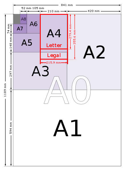
It's important to know what format of paper you should be working on, if your are given a brief od client asks for a particular size for a design you should be able to know the measurements and names for a digital layout or print.
Metric Name
A5 A4 A3 A3+ A2 A1 A0 |
Metric Size
148 x 210 mm 210 x 297 mm 297 x 420 mm 329 x 483 mm 420 x 594 mm 594 x 841 mm 841 x 1189 mm |
U.S. Equivalent
5.8 x 8.3 inches 8.3 x 11.7 inches 11.7 x 16.5 inches 13 x 19 inches 16.5 x 23.4 inches 23.4 x 33.1 inches 33.1 x 46.8 inches |
Rule is 8:13 - Fibonacci sequence is directly linked
1.62 is the golden paper size and it's principles can be used as a means of achieving balanced
design also known as the golden rectangle


10. PERSONALITY
design also known as the golden rectangle


10. PERSONALITY
Graphic design isn't just about you as a designer but you as a person. Your background and life experiences are what makes you an individual.
"Design is not your job. Design is about people, your personality and the ability to make relationships work is a massive factor in your employability" - Craig Oldham
No comments:
Post a Comment