Home
From my thumbnails and wire frames I began to start coding my website, starting with the container and following through with the buttons and external page links.


For the external links I also added a separate button code so that they would be positioned at the end of the pages.


A problem I faced was, when I clicked on these external links it would refresh over the original page. I then sourced another code so that the pages would open up seperately.


The main feature I wanted on my home page was a slider. I created some images for the slider which are shown in a previous post. I went online and sourced a code for a slider from wowslider. I downloaded the plug in and followed the instructions.


The plugin allowed me to choose how many images I wanted, the style of the slider and the movement. I had a few difficulties with this slider in regards to positioning and style. Initially I chose the slider to move around in a cube but it would place it's self above the navbar making it hard to see the buttons.
I then decided to make it more simple and to have a traditional style slider which benefitted my website more. Below are some active shots of the images and the slider.


One issue that I also had with the slider was the wow slider watermark that appeared in the corner of the homepage. I tried to get rid of this but accruing to the website you have to pay to get rid out it. To overcome this I will look in the code and see if I can delete it.
About
For my about page, I began by adding my text box for my about page, using the guidelines from my wireframe.


I began to add my body copy and then moving onto my title.

For the paragraph title I wanted a roll over image, so I added this above my body copy code and below was the outcome.


After adding my body copy I then had to move onto the image on the opposite side.
Gallery
To start my gallery I again followed from my wireframe and created another container for the images to be placed in.


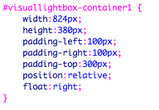
I made sure the container was the correct size by creating a background colour. From this I then followed onto using a plug in called visual lightbox, which was recommended by simon.
Initially I practiced with a few of my final images to see how it would look on the website.


I experimented with different templates, sizes and styles until I found the final design I wanted to use.


After a few attempts I finally found the style I wanted my gallery to be in, I then placed the code into my gallery file, which is displayed below.


Intially this process was going well until I started adding more of my content and the images wouldn't scroll. I realised due to my initial container not be called after the plug in that my content wasn't working so I adjusted this slightly.


I also added a scroll code so that all my images could be seen, however the scroll was too wide so I again had to adjust the padding slightly so that it was consistent and the user could easily navigate across the page.
After some consideration I thought I could add more images as I felt confident in knowing how to use the software. I created 60 images with all the same resolution, width and height and began to do the process again.


I created the design so that when users clicked on the image it would expand and then a small caption of information would appear. In my initial design only a small caption of text was used.


I began to start the process again, but this time inputting all my research about the magazines, listing their location, models, designers and art directors.
After uploading all the content onto the visual lightbox, I then published the design. However the initial overlay design didn't work. I experimented with extracting some of the content and images but it wouldn't work.


The design of the webpage just had hover over text with the image description in it and when the images were clicked onto the would be re-directed to a larger version. I experimented with trying to fix this for about 4 hours but it still stayed the same.
I then made the conscious decision to leave it the way it ended up. I made this decision because although the other design is more aesthetically pleasing, the user will find it hard to know about the image details if they have to go onto another webpage. If I have time I will go back and see if I can make any adjustments to the page. However I am really pleased overall on how it turned out because it looks exactly how my digital concept looked like.
Submit
For my submit page, I created a simple uploading vector box and headers to go alongside each other on the page. To create these features I used illustrator and working in the web profile mode. I also used the measurements from my wireframe to make sure that these would fit in perfectly.


After creating this content I then worked on setting up the code to make the features work.


I then experimented with the positioning of them, but they box still wasn't being placed in the right location.


To create my list page, I focused on my digital wire frame, whilst coding so the right measurements would come up for my page. I created 4 containers for the content which would then go onto more external links for the user to interact with and learn more about design composition.


Submit
For my submit page, I created a simple uploading vector box and headers to go alongside each other on the page. To create these features I used illustrator and working in the web profile mode. I also used the measurements from my wireframe to make sure that these would fit in perfectly.
I changed the context boxes to coloured one's to see where they would be arranged on the page and they weren't. in the exact location I needed.
I then experimented with the positioning of them, but they box still wasn't being placed in the right location.
I then decided to add the content to the page to see how it would look, but as displayed above it was still not in the right place.
I then again started to experiment with the padding of the containers within my code, but they still were no being centrally aligned.
After a lot of time, trying to make the images and text fit into the frame, I decided to make the conscious decision of creating an image with all the text on and placing it on the page.
I then decide to re-create the image making the boxed more closer together due to the big gap between make the page look really bland.
Although I would have liked to make the links working. It's something that I can reflect on and develop further for future projects.
List
To create my list page, I focused on my digital wire frame, whilst coding so the right measurements would come up for my page. I created 4 containers for the content which would then go onto more external links for the user to interact with and learn more about design composition.
Whislt following these steps I still had a lot of problems that raised when trying to make the boxes fit in the right positions which was similar to the problems I faced whislt trying to create my submit page. I again decided to make the same decision of creating an image with all the text on and placing it on the page.

The outcome of the page was exactly how I wanted it to look, with the only downfall being that the links were not active. Considering the amount of time I had spent on the website and future projects I still had to I thought if I had any extra time left I could go back rectify these issues.
No comments:
Post a Comment