For my buttons I didn't want anything to complicated when it came to the design. I opted again to use Helvetica at 10pt and with a rollover from white to red.
For my work I had drew up some initial idea's for the slider features which are displayed below. From these idea's I then began to start creating these designs digitally.
<image>
For my slider images, I wanted to design some images so there would be consistency though out the design of the website.
I started off by making sure all the images maintained the same resolution, width and height sizes. I then created a grid so that the images and text would have the same placement throughout also.
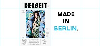
For the slider I used images of covers that will be featured in the gallery and the governor font which is also used in the logo at 30pt.
About
From my research on about pages I wrote up my own for the website. I wanted the tone of voice to be professional and sophisticated, so I looked at websites of the magazines I featured to get an idea of how to bring this tone across. Below is the final draft of what is going to be included.
"Editorial Edge, is an independent company that thrives of exclusive and innovative fashion cover design.
Our aim is to inspire, influence and give contemporary knowledge of what is out there in the design world by posting the latest editorials with all your favorite models, designers, art directors and so on. We are the leaders in presenting creative compositions from fashion magazines all over the world.
Before getting inspired it's important to know the importance composition. In it's simplest form it is the placement or arrangement of visual elements in a work of art. Editorial Edge, simply chooses the best covers that experiment with 21st century photography, type and layouts design that you wouldn't see in your local news agents.
Look at our pinterest / instagram pages for constant updates on what we have found for you to be inspired by and hopefully go onto creating."
For the other side of my about page there will be an image.
Gallery
For my gallery I wanted to featured the latest and aesthetically different compositions. Some of the images I sourced are not from 2013 but were created in the 21st century.
All the images and information I sourced can be found on my Pinterest page that I created specifically for the website.
Submit
For my submit page I simply created a image upload vector and some extra buttons that would act as headers.
Again I used the Governor font to keep consistency throughout the design, using them at 15pt.
List
For the list page I designed the category headers for the external website again using Governor at 15pt.
For the list page I designed the category headers for the external website again using Governor at 15pt.
The process in creating the design features for my website was easier than I anticipated. Due to working with the measurements on my wireframes and my digital mocks I knew how I wanted the work to look. By doing these prior saved me a lot of time.


No comments:
Post a Comment