Tuesday 25 February 2014

LAYOUT WORKSHOP: JACKSON RISING

For today's session we were set a task to design a flyer and concertina for the MoMA exhibition. In this task we were also given specific images, text and design requirements to complete this. We were also given time frames in which these designs had to be completed.

Flyer Design: 45 mins

Background: This simple layout will ask you to utilise a short amount of body copy, title, date, and location. The minimal amount of text allows for the simple use of single imagery and the type to serve as the main visual elements.

Brief: You are asked to produce a simplistic flyer design for Jackson Rising Exhibition at MoMA (Museum of Modern Art – New York) using the instructions below. 

Format: A5 – Portrait

For my flyer design I decided to go with white text on black as I think it would make the design stand out more. I kept the layout of the design quite simplistic and ordering the information in order of importance. 


Concertina Design: 2 hrs.

Background: This text/image heavy layout will ask you to utilise body copy, title, date, and location, heading, sub heading, imagery, indexes, highlighted quotes. The amount of text allows for the use of imagery and the type to serve as the main visual elements.

Brief: You are to layout and design a 10-page concertina folded brochure for a forth-coming exhibition titled ‘Jackson Rising’ at MoMA, New York. All images, copy and branding are included. You have to create a visually stimulating layout that showcases the artists’ imagery but does not sacrifice important information in this process. The images and information must flow harmoniously and offer a taste of what is to be expected during the exhibition.

Branding elements must be kept to black and white. Images must be unaltered and in colour.

Considerations: Headings, headlines, body copy, grid, type, colour, image sizing, bleed, margins, flow, audience, narrative, language, purpose, size, external print methods, preparing for print, stock, distribution.

To create my concertina design I didn't stick to the gris provided by phil, but just experimented with the placing the arrangement of my items until I felt they fit in with the aesthetic of my first flyer design.


(front / back)


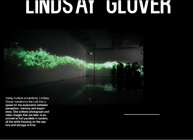
I wanted the images to work across the double page spreads so that the text could work around them in my design. I used two font's, kenzo and helvetica at point sizes 117pt and 12pt.


I found this session really beneficial in experimenting with layout design as it gave me an opportunity to see the ways in which I could experiment with the layout of my work for my research book. Also phil mentioned that when working in industry there might be artwork that isn't in a particular design or style format you like, but you have to experiment with it so it look aesthetically pleasing and legible for the client. This is something I will also take into consideration for future projects and briefs.

No comments:

Post a Comment