From looking into research publication styles, I found a lot of music posters also used a typographic art called glitching. This is something I have seen a lot recently in contemporary design and was something I wanted to experiment with in my work.
I took a simple san serif font with a quite I wanted to use about manchester that would be relevant to the context of my research and simply, using the scanner I moved the design according to the scanners beams to create a distorted style of type.
Below are a collection of the results I created, some more legible than others.

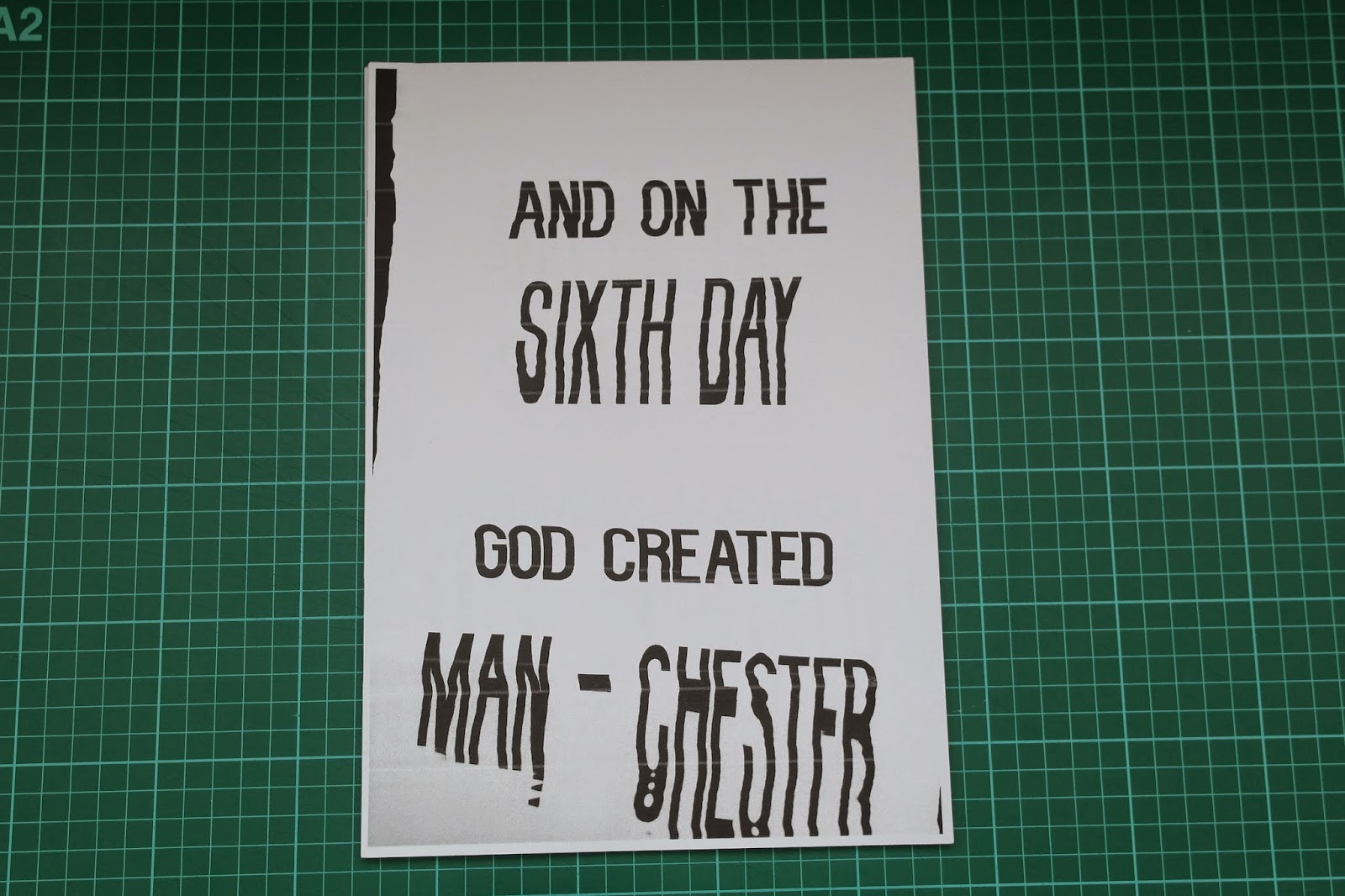


After these experiments I scanned in the designs again and edited them in photoshop to make the type more legible. I created this design as my final outcome and was really pleased with the experiment.

I enjoyed the process of glitching as it is a new skill I have acquired in my practice, this is something that I can utilise in other projects. I also think this style of typography adds a creative edge to the design which is what PIN studios is all about.
No comments:
Post a Comment