Showing posts with label OUGD504 DESIGN FOR PRINT. Show all posts

Thursday, 5 December 2013

DESIGN FOR PRINT: MOCK UPS & SPELL CHECKING

Before my final printing slot I decided to cheaply reproduce and create my booklets, to analyse the alignment, spellings, images and overall to see how they looked.  I also practice the hamlet binding method so I wouldn't make any mistakes before the final.


Book One


Book Two


Book Three


This mock up print before my final design was really beneficial to the development of my book, as I sourced a lot of spelling errors and unwanted alignment with my work. It looked totally different on screen that it did compared to the physical copy. By doing this small task saved me a lot of time a money by having to reprint my books again. 

Wednesday, 4 December 2013

BOOK 3: FOR THE LOVE OF DESIGN


(3 of 3)

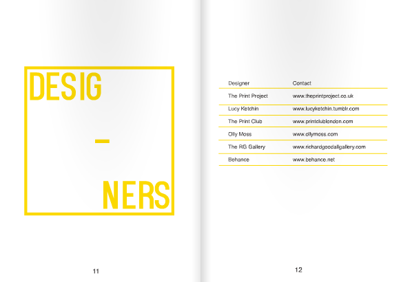
This book is based on what printing opportunities are out there and acts as a source of inspiration for students who don't know much about whats out there in Leeds. If features studio's, designers, ect. It also has extra pages for them to fill out when they find their own contacts. The design of the book follows the conventions of the others to create consitency.

BOOK 2: FOR THE LOVE OF ART


(2 of 3)

This book explains the mandatories of setting up your work in preparation for printing and what to consider before you design your work. It also has extended pages after the artwork chapter where the user can draw their own designs in preparation for print. The book follows the same style conventions as book 1 with some simple info graphics also.

BOOK 1: FOR THE LOVE OF PRINT


a few samples of stock will be placed in this section with labels of what they are.


(1 of 3)

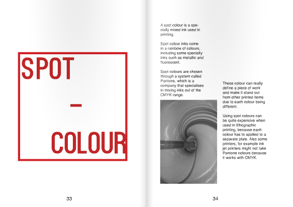
This book is based on the basic's of print to introduce what's out there, what you can achieve and some basic rules. Illustrated by secondary images. I chose to keep to book simplistic and straight to the point so it's easy to digest. Considering my target audience they said that the information they read was filled with text or there were images. I've tried to keep this balanced, modern and fresh.