The D&AD Asos brief has been a really fun and interesting brief. Over the course of working with my collaborative partner I have acquired new skills in how to use software and experimented with things I have not felt confident in before, which has helped me grow and develop as a designer.
In doing this brief I think I took on a more art direction role with the organisation of the photo shoot, looks and cross course collaboration which is something I am more confident in now than before. I think that in doing this I have gained a lot of new contacts that want to work again with me in future which is really beneficial.
Myself and my partner chose the brief because we have very similar interests in music, fashion and events and I think this is a main factor in how we thought of a good concept, due to our knowledge and passion on the subject.
Althought the brief has been a experience there has been a lot of ups and downs which can be expected in any collaboration. I feel like myself and my creative partner have different work ethics but with us combined we achieve what we could to the best of our ability. There are small factors such as time management reading over the brief in depth and roles that could have been more refined in our collaboration.
One example of this was when we created the prop for the ASOS shoot and painted it in our signature green colour, if we had read over the branding guidelines in depth we would have known that the logo couldn't have been changed and would of let us use more of our images that had impact.
Also we spent a lot of time trying to find someone to programme our app and focused on the printed material which was not something that was a mandatory. I think this showed that we wanted to push the brief further but it was essential for us to focus on the main task at hand, which was something I talked about with my partner and it enabled us to complete our work to a good standard.
Compared to previous group briefs I have been more assertive, I think is something I still need to work on in order to feel like a project is going in the right direction.
In doing this brief it has sparked an even bigger interest for me to work in a art directive role in the future, and was the main reason I joint a graphic design course. Putting these roles into play has made me realise what I want to achieve in the future.
Overall I have had a lot of fun working with my partner, there have been some really good idea's shared and developed and even if we don't win a yellow pencil i'm proud of what we have achieved.
Showing posts with label OUGD503 RESPONSIVE COLLABORATIVE. Show all posts
Showing posts with label OUGD503 RESPONSIVE COLLABORATIVE. Show all posts
Thursday, 20 March 2014
Wednesday, 19 March 2014
ASOS: SUBMISSION
For the submission of mine and my collaborative partners work I took a selection of screen shots to show proof that we had entered the competition.

I followed the necessary stops online to complete our work.


However due to submitting on the day of the deadline the website kept crashing and there was a lot of technical issues. I emailed d&ad and they said that if our work wasn't entered in on time that they would help us after the 5pm deadline and our work will still be judged.


After a lot of persistence I finally was able to upload all of our work and submit it for assessment.


In the final stages of submission myself and rinesh split the cost and also added our tutors name to our work.
The process of submitting the work was quite stressful, one thing I have learnt about d&ad is not to leave it till the last minute to submit the work and would be better off submitting the work a day or so earlier to avoid any change of not getting the work in time for deadlines.
Sunday, 9 March 2014
ASOS: DISTRIBUTION / PROMOTIONAL
One of my extended roles in the brief was to look at printed distribution and promotional material for the app. This was an on-going process throughout the module and had to be stopped and started again due to the design and aesthetics of the app.
Posters
I created a collection of potential poster designs for the app using blue and pink colours to show the representation of male and female users.


I couldn't fully complete these designs as I was waiting on images to be edited and the design of the app was still in development. I did take on my own initiative to create a style for the posters, however the inconsistency was going to be evident. Also these designs had to be discontinued due to re-reading the branding guidelines were the original ASOS logo could be altered or changed which is something I am glad we came across.
Mail Shots
After not being able to complete the poster designs, I started designing some mail shots in the form of a A6 two page spread. This would be distributed when a customers makes an online order and would be inside their delivery package detailing them on what the app was about.
Due to our app being catered towards both male and female I decided to create two mail shot designs for each sex.
I started off with the Female design using our signature beige / pink as a signifying on what sex it was aimed at and was the colours used in our app design.
- Front


(initial final)
- Inside
The inside spread of the flyer would be the same on both the male and female flyer with just some simple colour changes. I used the same fonts used throughout the app to show consistency and followed a 4x3 grid.


I tried to use the same patterns and designs featured with in the app also, so that the user could get a sense of the style we was trying to portray.


I also tried experimenting with changing the colour of images to reflect the same tone of the text, however I thought it took away from the whole design, so I continued to experiment with full colour images.


I showed my partner this design I had done and he suggested that I include an image of the app in context also for the page. I downloaded a mock up in photoshop and applied some of the app designs to the iPhone.


With this completed I again started to experiment with the layout and images until I found something that worked.


Whilst showing my developments to my partner I decided to quickly mock up the other design for the male flyer cover, using the same grid and style.

After talking throughout my designs my partner and I sat down together and made some changes to the designs to create something we both agreed on. The designs below and the final outcomes that were chosen. Although they are not what I expected there has to be a compromise when working within a collaborative in order to make both parties happy.
- Final designs


Due to the longevity of making sure the app was up to scratch we didn't have enough time or money to print out the printed material. So we decided to later digitally mocked it up how it would look on the presentation boards. In reflection I would have liked to have spent more time of these designs but the important part of the brief was to focus on the mandatories and make sure we had a strong concept and design of an App which we definitely achieved.
Saturday, 8 March 2014
ASOS: APP CRITIQUE
After completing my development idea's for the app I exported the design into a pdf for him to read through and critique. I also did this with the designs he had created so we could know what needed to be altered.
From our talk Rinesh really liked what I had created and wanted to use it as a basis for what the rest of app would look like. With this done rinesh took on the role of making small changes to app to make it all look consistent with some of my input on the final design decisions and added features.
I think that by splitting the workload gave use an opportunity to tackle the task at hand but didn't leave much time to complete the printed material for the brief. However this was not a necessity in the brief requirements and the most important thing was to get a well polished design and strong concept for the app.
Friday, 7 March 2014
ASOS: APP DEVELOPMENT
The app design has been quite a hard process to try and find what we was going to create. From our previous crits we were advised to focus on Asos Mode as the main feature of the App as it was more directed. I agreed with this as I thought combining all the excisiting Apps were not relevant to the brief and would make our project loose focus.
In agreement with my partner to go down this route we decided to look into the Asos Mode side of the app and start developing the pages through nets and thumbnails. To make the process quicker, I decided to create a net of how the pages would work and link together.
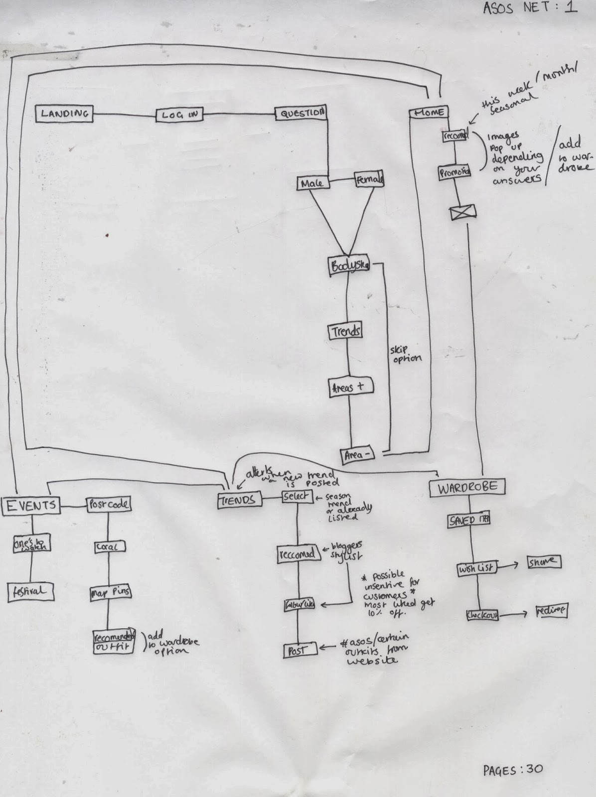
After creating this net I arranged for myself and rinesh to meet up and start mocking up how the pages would look and their features which are listed below.


My roles within the collaboration were more focused on the print and editorial extra's for the brief but due to time constraints, I decided to split the development of the App up with Rinesh in order for our work to be completed on time. I took on the second half of thumbnails to develop digitally.
Wardrobe
Below are some screen shots to show the development of how I created the wardrobe feature. The wardrobe allows users to save items that have seen on the app as a basis for being later or sharing with friends.


The wardrobe enables users to click on clothes and save them to buy later or send to friends and family in a wish list which is another part of the app. The design including a interactive slideshow of the images at a closer view and also simple product shots that could be clicked on to reveal the details of the item, to increase the photo's size or to add to the wish list.

I tried to keep inline with Rinesh had created previously in his developments and started adding background patterns and extra icons for the design.

Wish List
Below are some screen shots to show the development of how I created the wish list feature. The wish list feature is in conduction with wardrobe feature which allows users to email and share to their friends and family on what clothes they would want for potential gifts.


For this design I used the same grid as the wardrobe page and simply added the same design features to create consistency.
Trend Page
Below are some screen shots to show the development of how I created the Trend page feature. The trend page is a wall of images that show the latest styles posted from friends, users, celebrities and so on. The trend page is similar to how an Instagram page would work allowing users globally to connect and appreciate fashion.

After creating my grid for the page I started to add small icons to the image pages to show the judges how the audience would interact with the trend page by liking and commenting on the images.


To maintain consistency with the rest of my previous designs I decided to add a header bar with the page name.

The trend page was a separate feature on the app compared to the wardrobe and wish list so I experimented with using another colour, opposed to the pale pink to show colour co-ordination for each app feature.
My Mode
Below are some screen shots to show the development of how I created the My Mode feature. The My Mode page is a personal profile for ASOS users to see what trends they have liked, posted and have been suggested. This feature of the app enables users to have their own online identity defined by the likes and needs.


For this page I experimented with a few grid layouts and chose this one as the one to develop further as it had all the features that myself and Rinesh proposed and fit onto one page really well.


I started adding images and text to see how the design fit aesthetically and worked really well with what we wanted to achieve.

Again with this part of the app being linked to the trend page I decided to change the colour to a lime green to show colour co-ordination for the different app features.
My Mode Image Zoom
The my mode image zoom feature was just an extension of the page that had been created above to show how audiences could further interact with it. The images at the bottom of the my mode page can be clicked on and will resize to a bigger scale for the audiences to see clearly and read more info about the product.


For this design I simply took the my mode page layout and put a grey gradient over the top to indicate it was out of use. I then added a content box with a bold outline and added images and icons to show how it would work.

Again with the design being apart of the trend section I changed the outline to a lime green to complete the look.
Personal Stylist
The personal stylist page is a feature that allows users to follow stylist, celebrities and fashion bloggers as a source of influence Similar to Instagram and the my mode profile the stylist page is for more well established individuals in the fashion industry for people to look up to. I think this page was qute essential in the development of the app because we received a lot of primary research feedback from consumers about how the like to look at celebrity style.


I began to add scroll and follow buttons to show the audience how the profile could be interacted with.

Again with the design being apart of the trend section I changed the outline to a lime green to complete the look. I also added the same pattern from previous designs to keep the consistency.
Camera
The camera feature of the app allows users to upload and post their own looks the the trend wall and for people to share and interact with. This enables users to not only be inspired by what they see on celebrities but real people which was another thing we found from our primary research.


For the camera page I simply used a black gradient over the image and added icons to show how the camera could be used, adding features such as flash, rotation and focus.
Upload Option
The upload landing page allows users to add trend tags, descriptions and locations so that follows can find their images and be inspired


For the design I used a similar grid the camera page but just added a few extra boxes for the description, tag and location features. I also added a tag option of the image as you would on Facebook to show users how it would be interacted with.
Events
The events page allows users to interact with upcoming and local events as a social aspect for the app, fashion goes hand in hand with music as was also a main interest for our target audience of 20 somethings.

I created a simple grid, with a multitude of boxes to feature events within, I also took the search bar from previous designs so users could search for particular events and local ones with the location finder icon.

I began adding events in the area to include within the app layout until the grid was full, and added a scroll bar to suggest an interactive purpose.

Also with the app being another feature I changed the style to blue to again, create colour co-ordination for the user to identify with.
Events Recommended Outifts


For this design I used the same grid as the my mode page with some small alterations and kept the design a light blue as it was apart of the events feature to keep consistency.
The process of creating the app was quite difficult as I haven't done anything like this before and trying to make it look as it would on a phone or professionally was something I struggled with.
However in doing this I have gained some skills in how to design an apps aesthetics and considering the motions of how it will be interacted with by users. The app design was quite a long process making sure the designs were aligned, images were clear and that the colours and patterns run consistently. I also found that by splitting up the design of the app was beneficial for time and more productive development. Overall I enjoyed trying something new and now I have the skills and confidence to approach this type of digital design again.
Subscribe to:
Posts (Atom)