The process of creating my movie poster was a challenging process, due to me not really knowing what the film was prior to the brief, I felt that it was interesting to watch and research into the film and find out what it was about.
The film wouldn't be something I would usually watch but was really a new challenge and I enjoyed the process of picking out themes within the film to highlight and focus on. I also really liked looking into the work on Jason Munn and Olly Moss and trying a more minimalist / vector approach to my design work which is not something I usually do.
If I could do the brief again or have more time, I would have printed my work out on more alternative stocks,rather than antique white, or white card to see the range of outcomes. I would have also printed my work out on a professional printer rather than a home computer so that the quality of my work could have been highlighted.
However for final submission I will look into doing this and printing my poster at a larger scale. Overall I have enjoyed this short brief and seeing everyone else's outcomes for the brief and how they have interpreted the work.
Showing posts with label OUGD505 STUDIO 3. Show all posts
Showing posts with label OUGD505 STUDIO 3. Show all posts
Tuesday, 22 April 2014

MOVIE POSTER: SUBMISSION
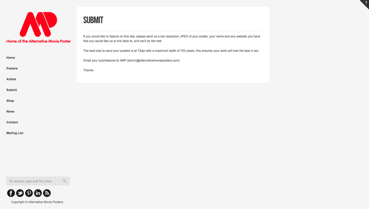
For the submission of my work for the website, I simply sent an email to the site and wrote a small message about my concept behind my poster and the film I selected. The process of submission was simple and easy to complete, this is something I could continue to experiment with in my spare time.


Friday, 11 April 2014
MOVIE POSTER: DEVELOPED FINAL
This is a revised version of my final design for the alternative movie posters submission. The design had to be 72 dpi and a maximum of 700 pix wide for the final submission.

Thursday, 10 April 2014
MOVIE POSTER: RECTIFICATIONS
From my critique with some of my peers I decided to develop my work further for the final submission.
One of the main comments with the film poster was that the design didn't look like a motorbike wheel so I decided to experiment with this until it did.


One of the main comments with the film poster was that the design didn't look like a motorbike wheel so I decided to experiment with this until it did.
I started the design by adding a spoke to the wheel to indicate what the circle represented and made in look more like a wheel.
I then started experimenting with the colour of the outer wheel and making it more prominent on the page.
After creating a design that looked more like a wheel I decided to experiment with trying to make the design look as though the wheel was moving. However when adding some moving gravel marks I felt that design had too much going on with it.
I then come up with this design as my final concept. I am really happy that I had the mini crit with some of my peers as I felt it pushed my design work further and made the meaning of my work more clear to an unknowing audience.
Wednesday, 9 April 2014
MOVIE POSTER: CRITIQUE
After creating two movie posters and not knowing what one to choose for submission I decided to have a mini crit with Vicky and Bobby to get their feedback on what they felt was the strong concept / design.
I showed them both the designs and took notes on the comments they had made about them.


I showed them both the designs and took notes on the comments they had made about them.
- I really like this design and the way you have manipulated the images.
- This design works well, but looks more like a poster than a movie poster.
- I think you should try changing the design from portrait to landscape.
- You should add more text about who is guest staring in the film.
- I don't understand what the image represents or is about.
- I think this design is a more suitable design for the Alternative Movie posters submission.
- I like the colour choice and it really stands out.
- You should develop the design more to make it look like a wheel.
From this mini crit, I felt that I had received some constructive criticism on how I could develop my work further. From the comments I think I am going to develop my second design more as it was more suited to the Alternative Movie posters website and their aesthetic. However I will still submit both designs and see which one they prefer.
Tuesday, 8 April 2014
MOVIE POSTER: FINAL OUTCOMES
From my experiments I chose these two designs as my final outcomes, although the submission only requires one design. I plan on having a small critique before the submission to see which design would be more appropriate and how it can be further developed.


MOVIE POSTER: FURTHER DEVELOPMENT
After experimenting with my first design I wanted to experiment with another way of portraying the film. I was really influenced by the work of Jason Munn and Olly Moss, I wanted to create a simplistic style movie poster using an image to represent the main themes within the movie.
From my thumbnails I proposed an idea of creating a motorcycle wheel, with the spokes representing the twisted paths that the protagonists travel. The path the travelled for their freedom was very hard and never ending until they were killed.

I then though of creating a maze to represent the spokes of the wheel to represented their never ending journey for freedom. By using the pen tool in illustrator I created a set of lines and duplicated and manipulated them until the made a circular shape.


I then tried to create the middle cog for the motorcycle wheel but felt that the design didn't look like a wheel but quite over complicated.

This then prompted me to experiment with different coloured backgrounds to see if the designs as suited better on another colour. I initially chose red as it represents the american flag, lust and death which are all themes within the film.

I then though about other colours within the American flag and chose to experiment with white to see how the design looked and really liked the outcome.

I then experimented with blue swell as it's another colour within the american flag, and also connotes a sense of freedom and the blue skys that were prominent in the film. I felt that the clue was the most striking colour out of all of the colours I experimented with and decided to use this as my main design. I used Pantone Uncoated 100-8 U for my design.

I then experimented with the middle spoke a little further and made the middle more clear, however I felt the maze was getting lost behind the blue background.

I then experimented with putting a black circle behind the maze to give the design more depth and felt this design work better aesthetically. I then started applying the film name, starts and the director of the film.

I then aligned the the text a little more to the right and felt that this design was ready for final submission.
In regards to my research and looking at artists before designing this film poster it was nice to see how they had influenced my work, I don't usually create minimal designs like this so I felt slightly out of my comfort zone but was really pleased with the outcome. I tried to stray away from using generic illustrated images such as a motorbike, a landscape or drugs and felt that this pushed my concept further and the overall design.
MOVIE POSTER: DEVELOPMENT
From my initial thumbnail sketches I was experimenting with fragmentation and surrealism. I thought that this was be an interesting concept to push further digitally as it would be a new challenge for myself as a designer and also because the travels the actors went on in the film had a lot of twists and turns within in it and this is what I wanted to represent through altering an image in Photoshop.

I started looking into images from the film and wanted to use one with the main stars on the open road.

I then started experimenting with the image in photoshop taking elements of the image and using the selection tool, I copied and pasted parts of the image and moved it up and down to create a shattered effect.

I didn't want to distort the whole image as I wanted it to represent the road that they are travelling on has a lot of twists and turns which is a main theme within the film. I then started to apply some font to the poster using champagne and limousines for the top line and hemi _ head for the film title. I chose to use hemi _ head as the film font because it represented movement with it's italic style and due to the film being created in 1969, I felt this design was fitting due to it's vintage aesthetic.

I decided to develop the design further by adding more lines to image but at a smaller width to add more depth to the image.

However after doing this I felt the design became slightly over crowded and removed the bottom lines away from the image to make the layout look more visually pleasing. I also felt that in doing this it made the top lines look like a city sky line which is another major theme within the film.

After experimenting with the layout, I chose to go ahead developing the final design and sticking within the two colour guidelines I decided to experiment with duo-tone. I chose to experiment with red, white and blue as these are the patriotic colours of the american flag.


After experimenting with these colours I decided to go ahead with the black and white design as I felt it represented the dark themes within the film of the film such as death and drug abuse. I really enjoyeed experimenting with type and image as this is something that I feel I can work well with when it comes to design.
I explored a multitude of themes that were introduced from the film in the development of this work such as, american patriotism, motorcycles, travelling, landscapes, fragmentation and many more.
MOVIE POSTER: INITIAL IDEA'S
After watching my film, I took all the notes I had written about the film and made them in to a brainstorm to see the different features that I had come up with that represented the film.


In the film there was a strong use of iconography in regards to the american flag and also a lot of shots of the open roads the two protagonist's ventured on. With this in mind and also my other idea's I decided to start developing these idea's in thumbnails of how the potential movie poster could look like.
The brief stated that only two colours could be used, so I wanted to experiment with red or blue plus white stock as they represent the american flag. In my research I wanted to replicate a simplistic style like Jason Munn and Olly Moss. I had both of these designers in mind while creating these small thumbnails as well as putting my own design idea's into them.
I firstly just experimented with solely type for my thumbnails focusing on just the main title of the film and then experimenting further by adding the stars names. Whilst creating these designs I referred back to my brainstorm picking out certain features such as the 'motorbike' and create italic style type to represent movement or liquified type to represent the petrol which was showcased within the film.
For my next set of experiments I explored with only image based designs to see what outcomes I could create. Again with my previous designs I focused on my brainstorm and created outomes from there. A main influence behind these designs was the never ending roads in the film and the themes of drugs, money and freedom.
Lastly I experimented with both type and image to create another range of potential outcomes. I tried to stay away from including similar style designs that I had done in my previous thumbnails which was quite challenging. However it pushed me to consider other aspects of the film to focus on. For these design the main influence behind them was the idea of surrealism and fragmentation. The camera shots in the film were very choppy and wanted to create these themes through this so I felt it was a good thing to focus upon.
In the majority of my previous design work I focus on using both type and image in my work. However exploring with just either using one or the other was a fun and challenging process. I found this challenging due to trying to make the poster clear with as little information on it as possible or just creating one iconic image that could be recognised by people who have seen the film before. Overall the development of my initial idea's process has helped me push my idea's and seen the range of possible outcomes for this brief. In total I mocked up 30 thumbnails.
Monday, 7 April 2014
MOVIE POSTER: BRIEF
To start the movie poster brief I read over the requirements and then re-write the brief so that it was tailored to the film I was looking at.

I did this to enable me to work from a specific set of guidelines and help me be focused for the course of the brief.
I did this to enable me to work from a specific set of guidelines and help me be focused for the course of the brief.
Subscribe to:
Posts (Atom)