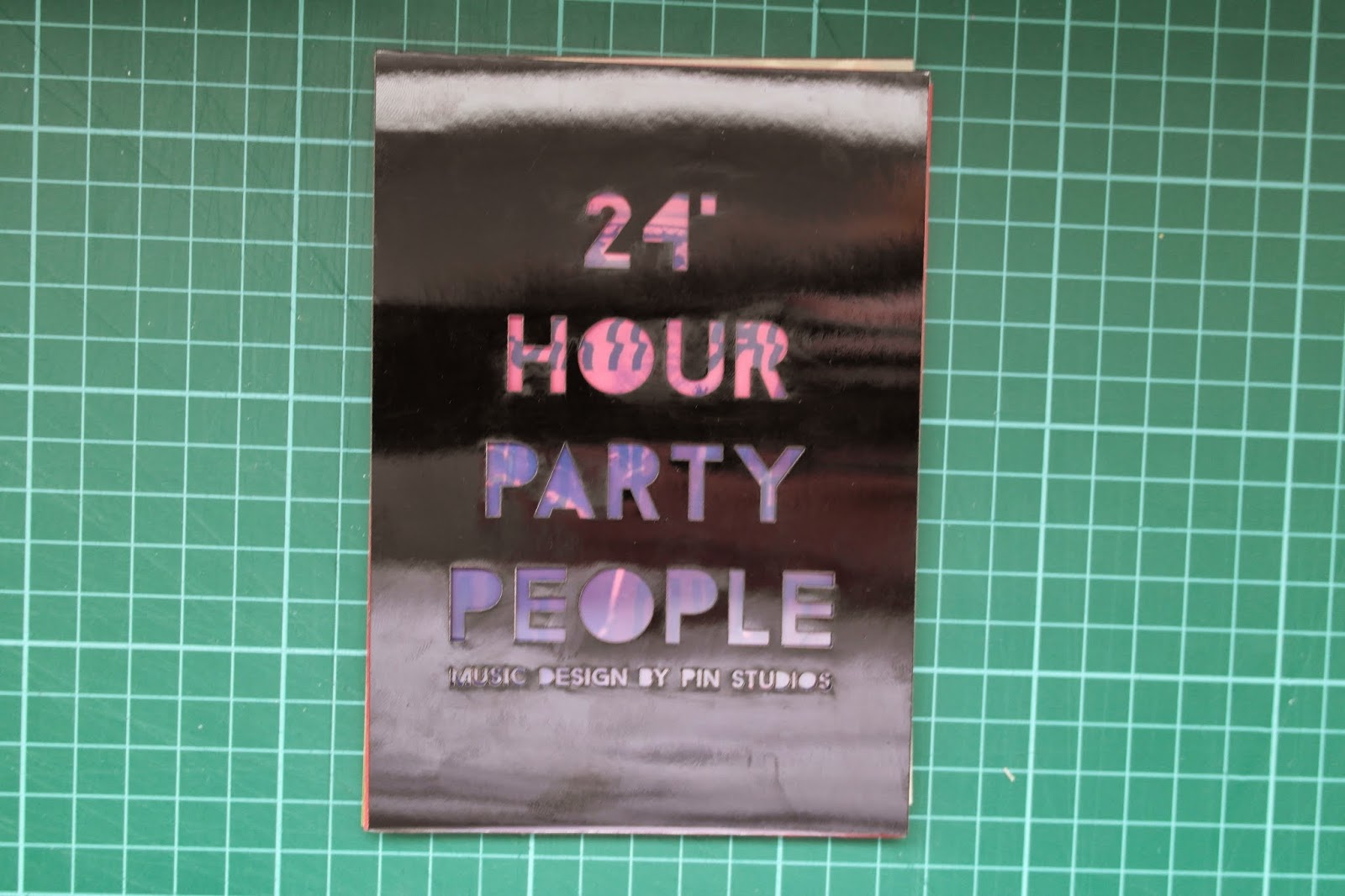
For my front cover I really wanted to experiment with different coated stocks, I went to Leeds Unions and sourced some mirri stock that I thought would be appropriate for my book and it replicated and coated style of flyer.
From my proposed thumbnails and printing an image on acetate I wanted to have a laser cut publication front cover so that the image would look through it I created my front cover in Illustrator using outlines.
After creating my digital front cover design, I decided to experiment with a multitude of stocks to get a varied outcome of possible from covers for my book.
I experimented with card, mirri and mount board which are displayed in the images below.
From all of my experiments I felt that the black mirri worked best with the rest of aesthetic of my book and overall gave it a really interesting finish.
I have really enjoyed experimenting with different stocks in the laser cutter, I feel more confident in using the software independently this year and has helped me develop as a designer.
After doing this, I went back to this cover and rectified it again due to me putting an apostrophe after the numbers.
I went back to the design and redone the steps for the final front cover.


No comments:
Post a Comment