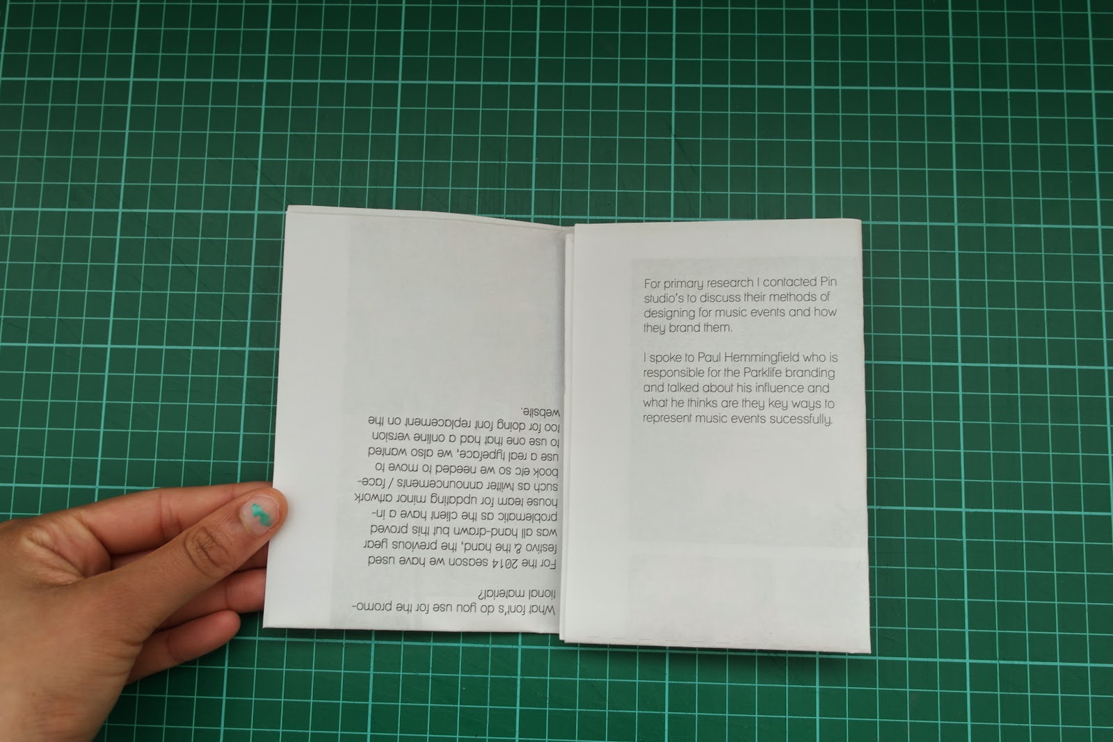
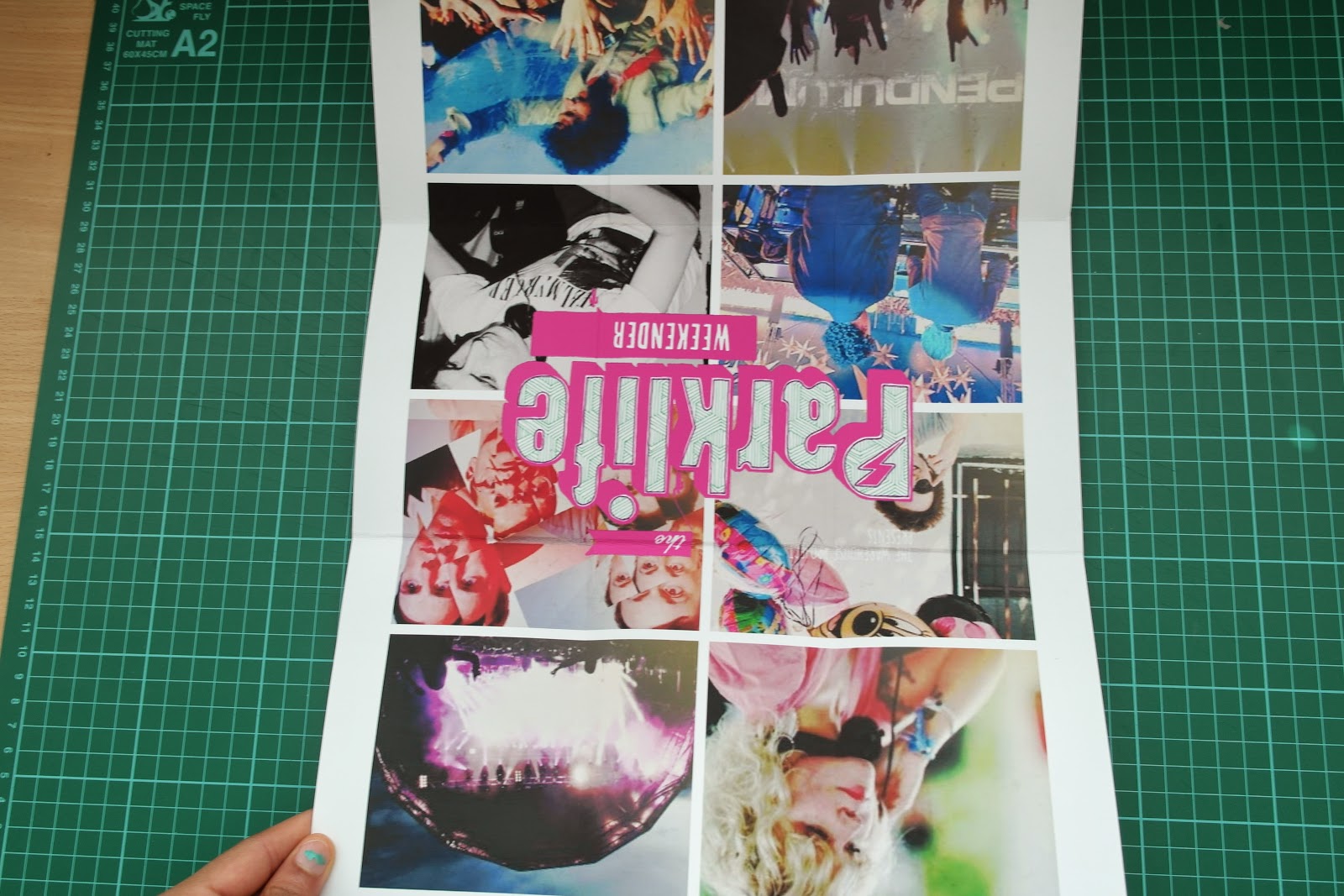
After I created my first initial poster, I didn't spend a lot of time thinking about the design as I was juggling other work. With some spare time I started printing out and developing mock ups to see how it would work.
Mock 1
The first mock printed upside down so i rectified this by changing the way in which it was placed.
Mock 2
After making these changes I then felt that the design didn't fit in with the rest of the aesthetic, I decide to develop the design further.
Mock 3
Finally I mocked up the design again with a more fitting aesthetic but after crafting it without crop marks my design suffered to this will have to be something again I go back to later on a rectify. I printed my poster out on thicker stock than usual so this could be the reason for the production method not going the way I planned.
Despite this I will develop this further for submission and ensure that I take more time when crafting.


No comments:
Post a Comment