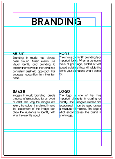
One of the main comments was the size of the research book, so I created a new document and changed the book from A5 to A6. I then refined the style and design of the content to ensure that it was cohesive throughout.
My peers recommended that I could change book to A7 but I felt it would be too small to fit all of my content onto and would cause difficulty when read. Also Lorraine recommended that I work with a 6x3 grid to create the book for the type of layout that I wanted to achieve.
Introduction
For my introduction page I rectified any spelling mistakes that were found in the crit and changed the content from first person to third, as these were also things that had been pointed out in the crit.
Using the grid I changed the placement of the boxes and expanded the spaces between the words for them to look even on the page.
I also changed the title font from Tommasso, to Baron as I felt the previous font was too decorative and didn't really fit in with the aesthetic of the book that I wanted to achieve.
After creating the page throughout the specific grid I wanted I felt I could experiment with the overall aesthetic. Looking back at my research, and influences such as Kate Moross I decided to create a few outcomes to see what worked best.
Concept
Following the introduction page I took on the same aesthetic approach, using the same grid and font's. I adjusted the images opacity and placement to the page to make it more symmetrical. However I still felt it didn't look right.
I then decide to go into depth about what my concept was behind my research and follow the same pattern as the page previously.
Branding
After developing these two pages I felt they lacked consistency with the rest of my pages to I referred back to my grid and adjusted the text boxes.
The Warehouse Project
For the warehouse project pages I continues to follow the same style guidelines, keeping the content boxes at the same width and making sure that fitted within the grid.
Now Wave
Parklife
Excising Products
Range Images
Distribution


No comments:
Post a Comment